Naloxone
The development and evaluation of a universal information design response for opioid poisoning
Between 2016 and 2018, over 11 000 Canadians and 136 000 Americans died from accidental opioid overdoses—triple the number of deaths caused by motor vehicle accidents (Government of Canada, 2020). In response to this crisis, the Government of Canada increased access to life-saving naloxone kits nationwide. A 2019 Government of Alberta study found that naloxone kits are present at the scene of most overdoses but are often used incorrectly or not at all.
The project aims to explain opioid poisoning and response through effective information design. In emergency situations, critical information must be presented clearly and accessibly so that it can be quickly acted upon.
About the project
01
Research
User Centered Design Approach
comprehensive analysis of overdose prevention kits, visual materials, and communications from Canada’s provincial and territorial health authorities
Survey
Co-design Session with Experts (harm reduction educators, emergency physicians community responders and people who face these conditions.)
User Testing
Framework
Personas
The personas were developed based on insights from literature reviews, surveys, and interviews, focusing on three main audience segments:
First aiders and medical professionals
Individuals with familiarity with drugs or drug overdoses
Community members without training in these areas
Character Design
We used insights from literature reviews and gathered feedback from surveys and workshops with experts to create the following set of illustrations. During co-design sessions with experts, we found that the first option was perceived as friendly and culturally appropriate, while the second option was seen as more accurate and educational. By combining elements from both illustrations, we created a design that strikes a balance between being friendly and culturally appropriate, while also being accurate and educational.
Data from Co-design Session With Experts
02
Visual Identity
We created a color palette that conveys a friendly and welcoming vibe while ensuring easy readability with high contrast. We chose colors that are familiar to viewers and avoided complementary colors and bright, highly saturated hues based on research. These choices were made to improve the user experience and ensure clear understanding of information.
For the font, we chose Meta for its humanistic design and readability. It works well for information design, offering clear and legible text for all audiences.
Typography
Color Palette
Illustrations
“Consider visuals - can this be understood by an ESL or individuals of all education levels?”
Wireframes
Toolkit
Educational Materials
Participant A
“There is an opportunity to have a voice that says: this isn't scary, you can handle this.”
Participant B
03
Educational Materials
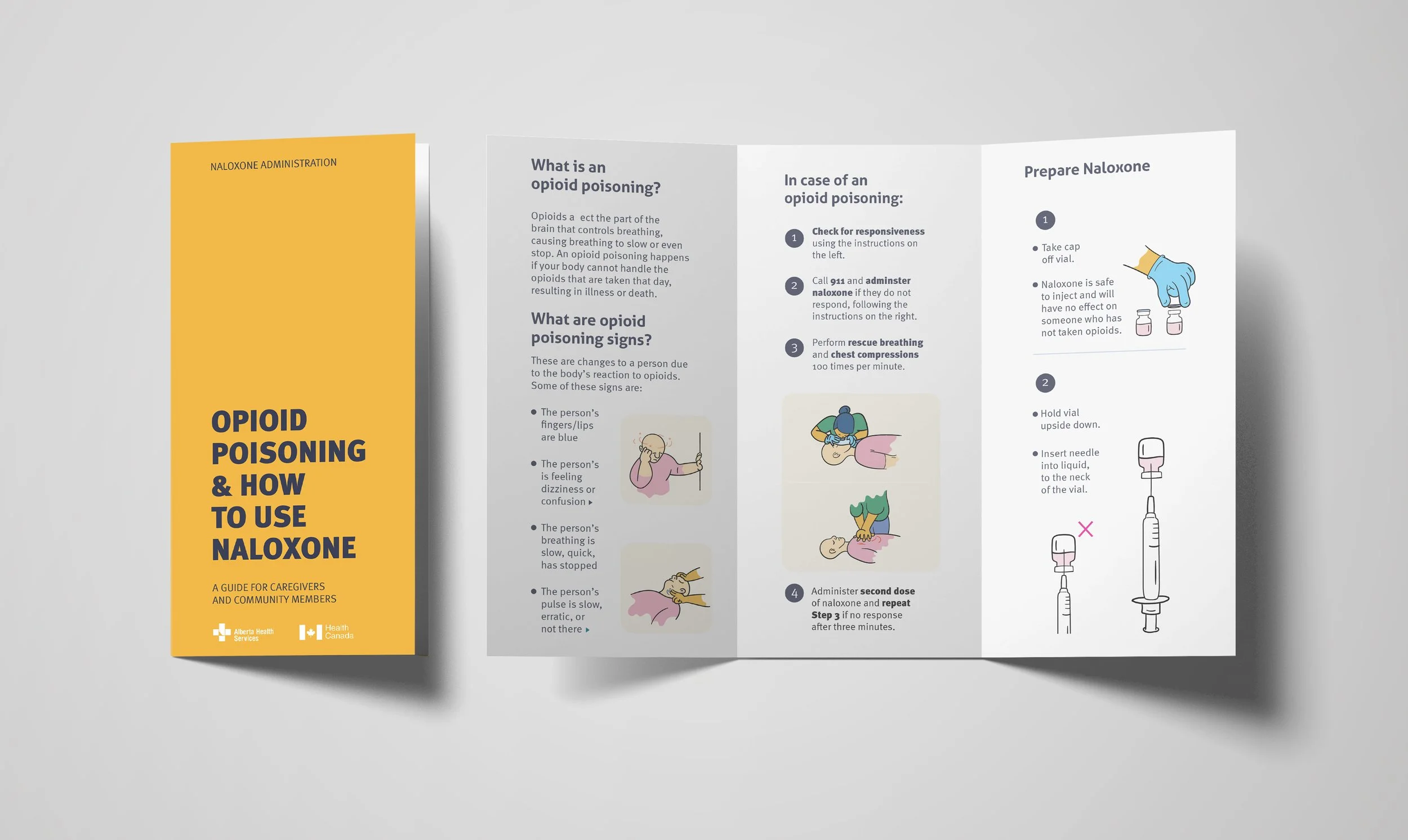
By conducting research and gathering data from co-design sessions and interviews, we formulated the content for posters and brochures. We considered factors such as the number of steps required, the flow of information, whether to reference the Good Samaritan law, etc.
Monotone
04
Nasal
Injection
During the co-design session, we engaged in several activities focused on designing signs and symptoms characters. Our goal was to ensure that these characters accurately depict the situation and are easily understandable without relying on text. Additionally, we made a conscious effort to avoid using jargon in the content of our documents, ensuring accessibility for people with varying levels of literacy.
An online presence
The DORE website is a central hub for our project's research, tools, and resources. Visitors can learn about the team and download illustrations and design assets for crafting their own materials related to opioid poisoning.
The website is being developed as a responsive and interactive platform, specifically designed for three main audiences: (1) first aiders and medical professionals, (2) individuals familiar with drugs or drug overdoses, and (3) community members with no training.
DORE Branding
Typeface
Colors
Sitemap
The toolkit section offers a variety of illustrations and design assets for users to create their own designs. Users can access PDF and Google Doc versions of posters like Nasal, Injection, and Sign and Symptom, as well as a brochure. The Google Doc has restricted editing, requiring users to request access. Once confirmed, they can make changes as needed.
Illustrations come in different skin tones, ensuring diversity in representation and allowing users to choose the one that suits their needs.
Users can access all the materials developed over the past few years for opioid poisoning across Canada through the website. These resources are categorized based on the province they were created in.
Resources
The website includes an online module where users can learn how to administer naloxone, recognize signs and symptoms, and provide care for laypersons after administering naloxone. Access to the module is through scanning the QR code on the wallet card included in the naloxone kit. It is designed to be accessible, user-friendly, and can serve as educational material beforehand or as on-the-spot guidance during emergencies to assist laypersons.


